The Intelligence Feed
How might we redesign the homepage so it feels less like a static starting point and more like a dynamic, personalized guide
00

.overview
Redesigning the core homepage experience to accelerate user activation and long-term engagement. The goal was to transform a static interface into a high-value consumption feed that delivers personalized insights with minimal cognitive effort for both first-time and power users.
.impact
By aligning algorithmic relevance with a modernized visual language, the redesign successfully moved the needle on the company’s primary retention metrics: Improved Sentiment: Qualitative feedback indicated a stronger sense of "personalization" and "relevance" without sacrificing the platform’s professional utility.
.my role
Product designer
The original homepage centered on "Agent Updates," notifications for automated workflows the user had already created. However, user research revealed a critical flaw: the experience relied on the user being an "expert creator" from day one.
Key Friction Points
The "Bounce" Effect: Users immediately left the home screen to find value in the "Discover" tab, indicating the default view was failing to provide immediate utility.
The Empty State Problem: For new users or those with inactive agents, the home screen felt stagnant and "stale."
The Signal-to-Noise Ratio: Agents often reported "no meaningful changes," leading to a feed filled with low-value updates that trained users to ignore the screen.

.challenge
Solving the "Value Gap"
To bridge the gap between user expectations and the current UI, I led a cross-functional kickoff with Engineering, Product, and Customer Success. We conducted a competitive teardown of high-density information platforms (Perplexity, Feedly, Robinhood, etc...) to define "Table Stakes."
Core Insights
Home isn't a destination; it's a launchpad. Users need a balance of passive consumption (news/updates) and active intent (starting a task).
Meaningless deltas are noise. If an agent finds no change, it shouldn't occupy primary real estate.
Visual Hierarchy was flat. The previous design lacked the "gravity" needed to draw users into a deeper session.

.research
Market research & discovery
01

The Newsroom
Focus on global market trends and news ingestion.

Pros
Very visual, users absorb information much quicker through visuals than text.
Potential for cyclical consumption through embedded news stories and recommended agents attached to each news theme and/or topic.
Large amounts of information being aggregated into digestible themes.
Potential Cons
The news themes are not always relevant to every user without very robust and dynamic algorithmic learning of user behaviors.
This problem is particularly difficult to solve in the finance space as users often worry about machine bias and affirmative “wind tunneling.”
Outcome
Rejected: Users felt it lacked "proprietary value" and risked "echo-chamber" bias.
The Launchpad
A helpful launch pad intended to split the difference between consumption and action. This idea seeks to bounce between offering useful actions that guide a user towards more beefing up their platform experience alongside showing valuable content recommendations.

Pros
Shows clear options to improving the existing Alfa experience.
Dynamic content generation tailored to a users preferences.
Helps to solve the “first use” problem where a user doesn’t know what they should do first in the platform.
Potential Cons
Directional intent would have to be carefully managed as it could become less valuable over time as a user demonstrates increased expertise over the platform.
The home page becomes less consumption based overall which will ultimately drive users to other parts of the platform.
Outcome
Pivoted: Great for new users, but lacked the "habit-forming" nature of a content feed.
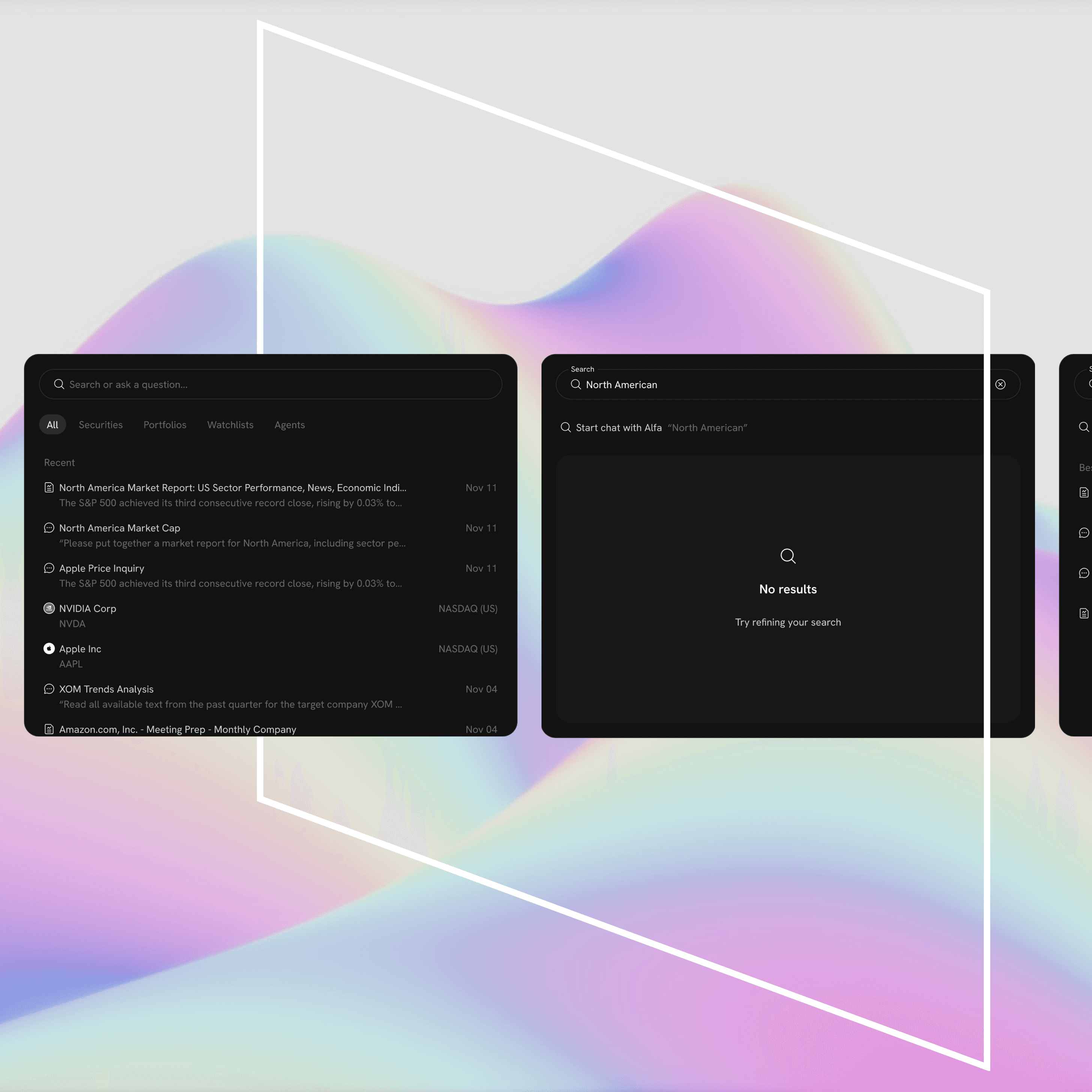
The Intelligence Feed
A hybrid chronological feed of agent work and curated templates.

Pros
Familiar patterns associated with social media bring an endless consumptive interaction.
More multi-modal compatible.
Potential Cons
Highly dependent on our ability to generate an endless feed for users.
Runs a similar risk to showing less relevant information.
Outcome
Selected: Provided the best balance of familiarity and personalized utility.
Additional Selected Artifacts
Users in our system still have the ability to create custom workflows and reports. I didn’t want to completely abandon the concept of showing updates from these elements but felt trying to differentiate them from other types of content would serve as a point of confusion.
My solution to this was to relocate a notification style mini feed to the side content rail that could serve to show the user updates from theirs or their teams agent workflows

.design
Design iterations
Action-Oriented Header
Placed a "Prompt Box" front-and-center to lower the barrier for agent creation, turning a passive page into an active workspace.
Agent Card Taxonomy
I redesigned the information architecture of the cards. Instead of just saying "Agent Updated," the cards now summarize the specific work performed and the resulting delta, giving the user a reason to click.
Contextual Follow-ups
Added "Quick Actions" to each card to encourage engagement directly from the feed.
Predictive Onboarding
We leveraged the template library to inject "suggested agents" based on the user's watchlist, solving the "Empty Feed" problem for new sign-ups.
.solution
The Intelligence Feed
02

03

Reduced Time-to-Value
New users now engage with their first "meaningful insight" within the first 60 seconds of login by interacting with the suggested agent templates.
Increased Session Depth
The "Intelligence Feed" led to a 25% increase in secondary actions (clicks on follow-up suggestions), proving that users weren't just viewing content, but acting on it.
Scalability
The new card taxonomy provides a modular framework that allows the engineering team to introduce new content types (videos, data visualizations, or alerts) without breaking the visual language.
What I Learned
This project reinforced that in AI-driven products, "empty states" are a design failure. By moving from a "user-generated" model to a "curated discovery" model, we successfully reduced the cognitive load on our users and turned the homepage into a retention powerhouse.
.wrap up