Improving Discover
How might we evolve the discovery feature to help users manage high volumes of data?
00

01

.overview
Redesigning our discover feature to be more user-friendly alongside added bulk operation features.
.impact
The sheer amount of content that Alfa was offering to it’s content is a direct selling point for users. Reports being ran across different names, indices, and themes was vast but users were having trouble navigating all of it. This project directly addressed this user pain point as well as having the knock-on effect of helping to streamline internal teams abilities to scale agents across many research vectors.
.my role
Product designer
Discover is a simple way to direct our users to value without wrestling with the black box
Discover in the boosted platform has taken a few different forms throughout the years. This project has centered around taking some of those old ideas and reimagining them for a more contemporary setting. We wanted to create a better consumption based experience for our users that would deliver consistent value quickly and easily.
To ensure we were thinking about the right problems in the right ways, we formulated our process around consistent iteration cycles that we could test with current real users. Drawing on their feedback at every step to keep the designs focused on them. Similarly, we did a hefty amount of tear downs on products we love to help derive inspiration.
In our user interviews, users were impressed by the amount of content but found it difficult to navigate
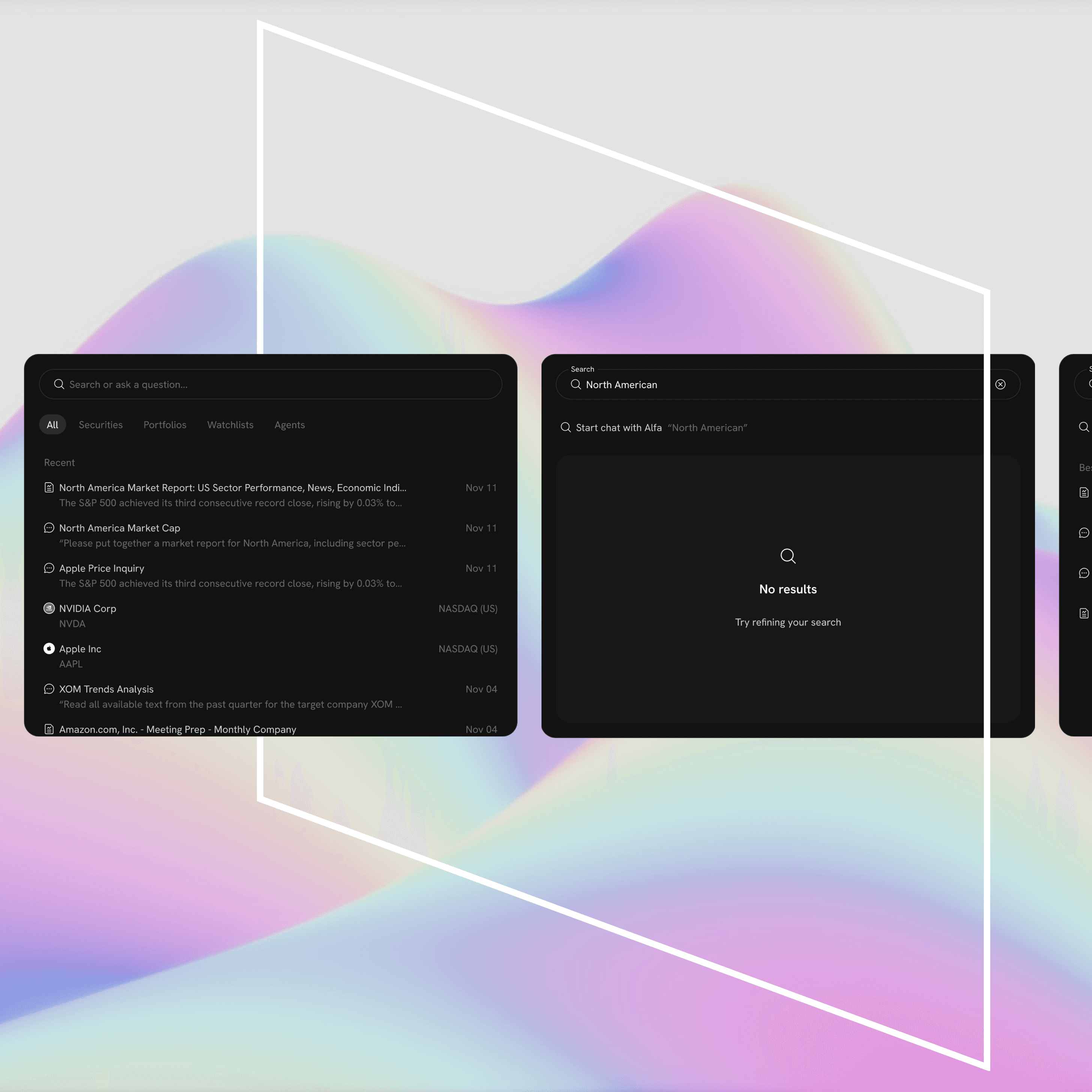
The original concept utilized a two column layout with the different discoverable reports present on the left while the view of the report itself was present in the right panel. This offered a simple interaction to clearly tie the two elements together, however...
The sheer number of discreet reports available combined with a search bar and vertical scroll as the only way to sift through the list quickly became a frustrating experience for our users.

.problem space
What are we trying to solve?
Back to basics — what did our users want out of a discover feature to begin with?
Our users craved customization while simultaneously wanting value to be delivered to them without deliberate effort on their part. “You’re the smart ones, show me what I should care about” was a consistent theme across user interviews we conducted.
Additionally, once a user discovered something that was relevant to them, they typically wanted to spread that value across a greater number of targets. “This is interesting, can you do this across multiple assets?”
Our previous solution to this plan was to leverage the chat interface to field these types of requests from users. The results of such were mixed; while using an LLM to act upon simple input changes felt broadly intuitive, it lacked the precision that direct select offered as well as the certainty that the previously used deep research plan would be fully respected.
Taking all of this in, we sought to design a solution that felt familiar to our user base while still utilizing the deep work the LLM’s had previously done.

.level setting
Sketching a new interaction pattern
Firstly, recognizing that different financial professionals tend to be looking for different things out of a research report, we decided to convert to a tabbing system that focused their job titles as more higher level organizational method.
Using these job title buckets, we then organized specific reports into categories that made more sense. Adding titles and explainer text to help users more quickly skim the page and find something useful to them.

We added a more visual tagging and indexing system to lay the ground work for more robust filtering capabilities. We then added a filtering system to help users that knew specifically what they were looking for to find reports.

In addition to filtering, we also wanted to provide a more guided experience for users who were less familiar with the platform through the “all” tab. This would be fed by our recommender algorithm in conjunction with user data that had been collected through onboarding and previous chats the user had with the system (memory) to then surface the more relevant reports to them.

.solution
So what did the solution look like?
Ok, so how do you scale this into maximal use value?
This is where the fun begins. The object that principally produces a report that a user resonates with is the deep research plan. Once a user has this deep research plan set in place whether it was created by them through our chat interface or surfaced through the discover feature, they wanted to scale it across any number of objects that would normally take an immense amount of time to produce.
The design incorporates a right hand panel surfacing the discreet inputs represented in plain english that ultimately produced the report in the main content rail. From here a user can duplicate this agent and direct it towards some other object within the Boosted ecosystem.
Once a user had modified the inputs they can now choose to run the deep research plan as a single massive report or individual reports across all the different target assets, netting any number of reports ready for consumption.
Alfa will then summarize the work it is about to do, give you a rough time estimation for how long it will take to run that particular research plan across however many targets and, provide a rough token estimate of work being done.
.solution cont
Scaling the solution
02

03

The reimagined Discover feature successfully bridged the gap between Alfa’s vast content library and the user’s need for effortless, high-precision value. By moving away from a restrictive two-column layout and leaning into a persona-driven architecture, the project delivered three key outcomes:
Intuitive Navigation via Persona-Based Architecture
To resolve the "navigation fatigue" identified in initial interviews, we replaced the vertical-scroll list with a tiered tabbing system organized by professional job titles.
Contextual Organization
Reports are now bucketed into specific categories with clear explainer text, allowing users to skim and identify value in seconds.
Algorithmic Curation
The "All" tab leverages a recommender engine and "memory" from previous user chats to surface high-relevance reports automatically, fulfilling the user request: "Show me what I should care about."
Precision Customization over "Black Box" Interaction
While the previous LLM chat interface offered flexibility, it lacked the certainty users required for deep research. The new design surfaces the Deep Research Plan in a dedicated right-hand panel, translating complex backend logic into plain English. This provides:
Transparency
Users can see exactly which inputs produced a specific report.
Direct Control
Users can now modify inputs with "direct select" precision, ensuring the deep research plan is respected without the ambiguity of a chat interface.
Infinite Scalability through Agent Duplication
The most significant breakthrough was the ability to scale "maximal use value." Users can now take a successful research plan and duplicate the agent across the entire Boosted ecosystem.
Bulk Execution
Users can run a single plan across multiple target assets simultaneously, transforming a manual, time-consuming process into an automated workflow.
Operational Clarity
Before execution, Alfa provides a comprehensive summary, including estimated time-to-completion and token usage, giving users full oversight of their research pipeline.
Final Impact
By shifting from a consumption-only model to a creation and scaling engine, the Discover project did more than fix a navigation issue—it empowered financial professionals to leverage the full power of Alfa’s LLMs with the precision of a surgical tool.
.wrap up